Approaches
To best redesign the checkout flow, I reviewed call center logs on checkout to find customer complains and concerns during checkout. I then participated in the user research sessions to observe how our customers struggle during the process. To put my findings in perspective, I used affinity mapping, user persona, user journey map and storyboards. When I solution for a better design, I drafted user flow diagrams, documented all existing and future use cases, and performed competitive analysis for store pickup, cart, and checkout. The research and analysis guided my new design so that I can address the customer needs. After several iterations, I was able to come up with a final iteration that is easy to understand, aesthetically pleasing, and take less time for a customer to complete the whole user flow.A. Review Call Center logs
I reviewed call center logs on checkout to find out how our customer struggles with the existing checkout process. After group my findings using affinity diagrams, here are the top three critical frustrations among all customer complains:• Customers were overwhelmed with the available fulfillment options; thus they were having a hard time finishing the checkout flow.
• Customers weren't sure how much they would pay, or they found errors with the price calculation when aggregating points redemption and coupon codes, so they either not complete the purchase or having extreme anger with our checkout flow.
• Most one-time shoppers were unfamiliar with Sears ShopYourWay member program and found ShopYourWay Max options distracting.
B. User Testing
Sitting in the user research sessions and observe how customers interacted with the checkout flow helped me identified the gaps in the current design. Here are my main discoveries:• Giving customers the options to select how to bundle their items in cart confuses our customers.
• Our customers were not aware that Sears sell marketplace items, thus expect Sears to fulfill marketplace packages.
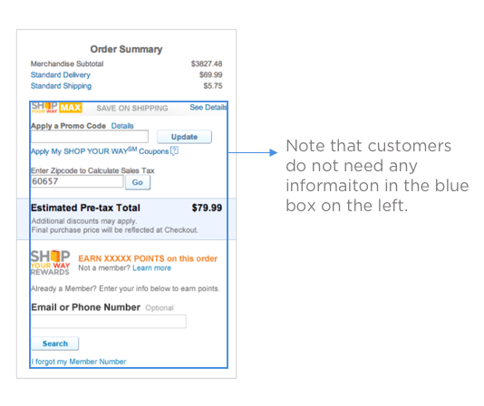
• The pricing card contains irrelevant information that prevents a customer from reading the total cost of the purchase and result in a customer abandon the cart during checkout. Apart from cost calculation, the price card includes entering the coupon, entering email and phone number, entering the zip code for sales tax and joining ShowYourWay for a discounted price.
C.Findings
• Customer want to check out as soon as possible with minimal distraction• Customer assumes shipping to be the default option when purchasing online
• Customer expect us to choose the best package bundle option with the lowest cost and fastest arrival speed
• Customer don’t care if we ship in separate packages and assume we have done the work to make best shipping options available to them
• Customers are likely to quit purchase an item if they get distracted during the checkout flow
• Customers are very concerned with the total cost and want always to know how much they will be paying and whether they are saving money from a deal
• Customers are unlikely to convert shipping to store pickup once they land on the checkout page.
D. Competitive Analysis
I performed competitive analysis to gauge our performance compared to our competitors and to understand the strengths and weaknesses of their design approach. I also want find out: how do our competitors solve the problem we struggle with? Ideally, after our redesign, our overall usability and performance should outperform our competitors.Task based comparasion
- Add to cart
- Choose fufillment options on product detail page
- Sign in during checkout
- Choosing and complete payment
- Select fulfillment option during checkout
- Apply points and coupon during checkout
- request help when having issues during checkout
Feature comparasion
- Price card across PDP and final checkout
- Help informaiton
- Member service and credit card marketing
Other comparasion
- design philosiphy
- color theme
- prior user knowledge
E. User Jorney Map
F. User Persona
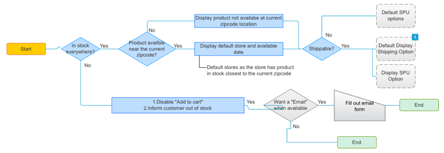
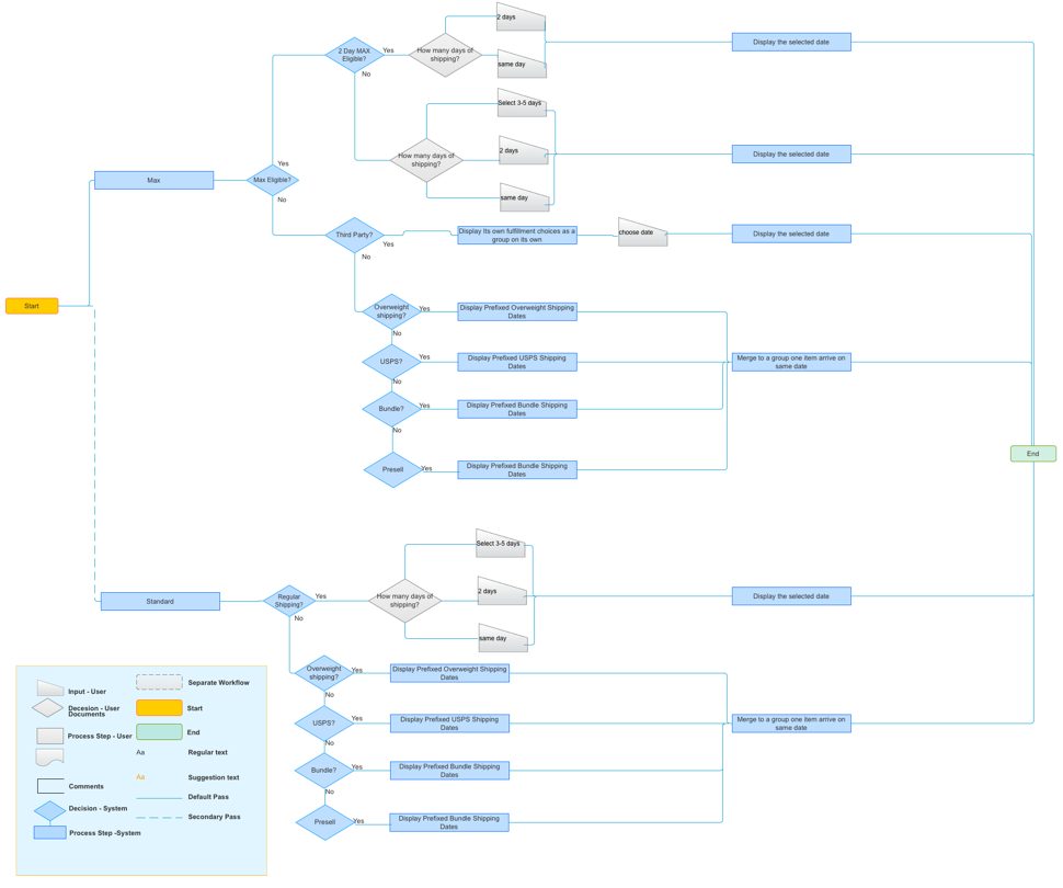
G. Review existing and future user flow